The Dashboard centralizes network visibility through a suite of interactive tables and visualizations, enabling operators to quickly identify active assets and monitor ongoing network activity.
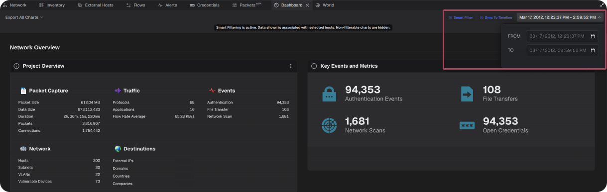
The Dashboard can be synchronized to one or more selected hosts, the global timeline, or the time range can be configured manually. When synchronized, all visualizations update dynamically to reflect only the data within the defined time range.
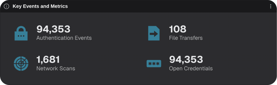
Key Events and Metrics
Displays key events detected across the network project, including authentication activity, file transfers, vulnerability scans, and exposed credentials.
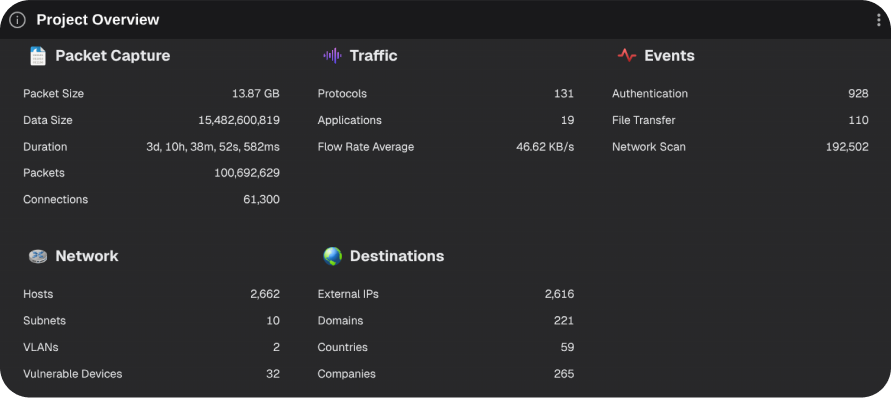
Project Overview
Provides a high-level overview of the network project including packet capture details, traffic statistics, event counts, network summary, and destination information.
What to look for: Unusual volumes of events or metrics that may indicate security risks or threat activity.
Subnet Details
Displays VLAN membership for each subnet alongside host counts, connection volumes, and historical activity trends.
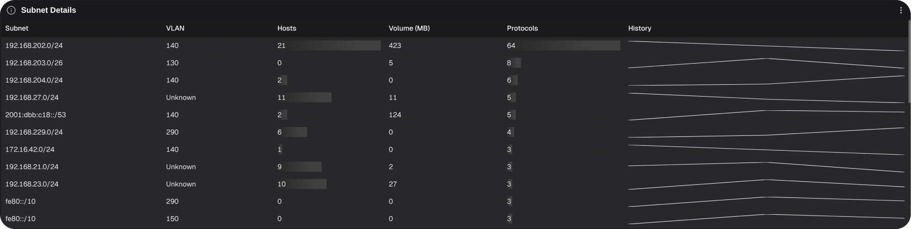
What to look for: Unrecognized subnets, anomalous connection patterns, or subnets exhibiting disproportionate asset counts or connection volumes.
Subnet Connection Volumes by Protocol
This heat map shows connection densities for different protocols from subnets on the network. Hot spots indicate high volumes while cold spots indicate low volumes.
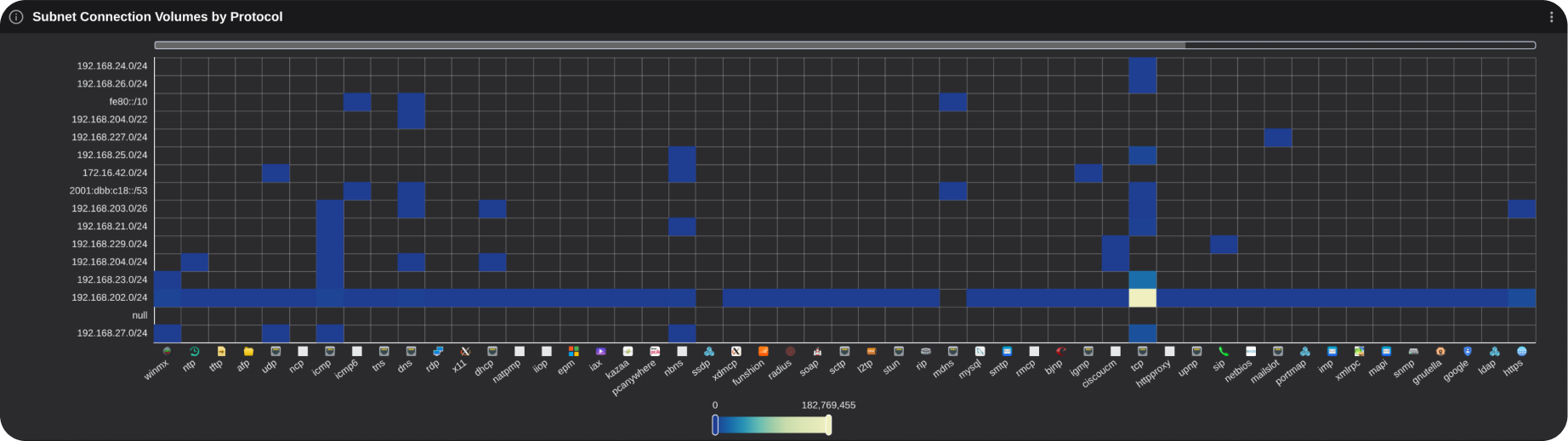
What to look for: Unexpected connection volumes or protocol usage patterns for a subnet.
Top Host Types
This bar chart ranks top host types on the network.
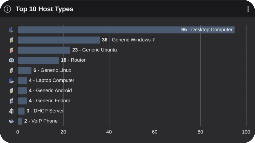
What to look for: Unexpected host types with abnormally high or low counts.
Top Operating Systems
This bar chart ranks top operating systems on the network.
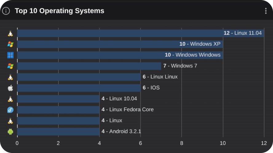
What to look for: Unexpected OS types with abnormally high or low counts.
Top Hardware Vendors
This bar chart ranks top hardware vendors on the network.
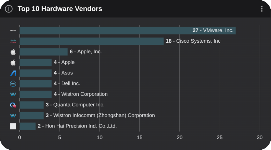
What to look for: Unexpected vendors with abnormally high or low counts.
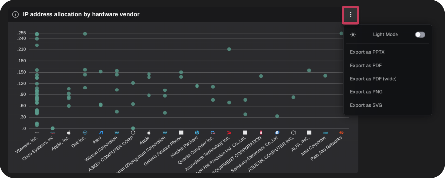
IP address allocation by hardware vendor
This scatter plot shows the distribution of IP address last octets by hardware vendor. For example, the last octet of 192.168.0.100 would be .100.
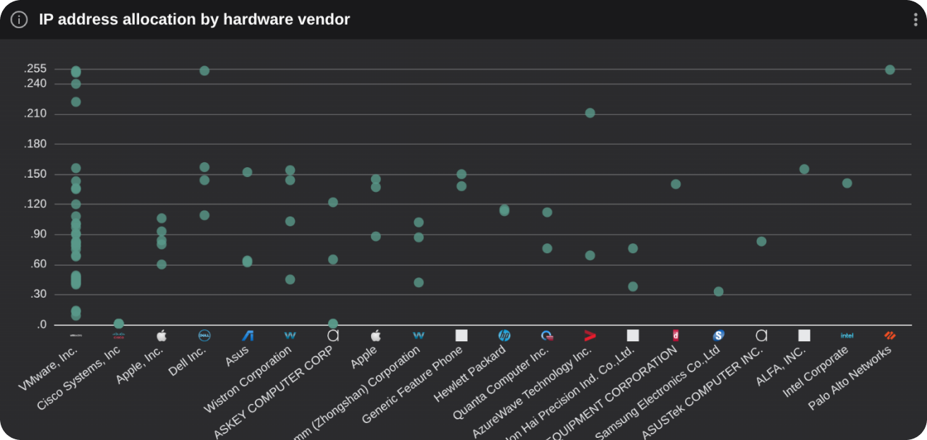
What to look for: Hardware vendors with unexpected octets, unusual clusters of IP address allocations, or a large number of unexpected hardware vendors.
Traffic Overview
Displays upload and download traffic data across two charts:
- Total Data Transfer: A donut chart showing the ratio of data uploads to downloads in bytes.
- Total Bandwidth History: A stacked line chart showing historical data transfer rates for the selected timeframe.
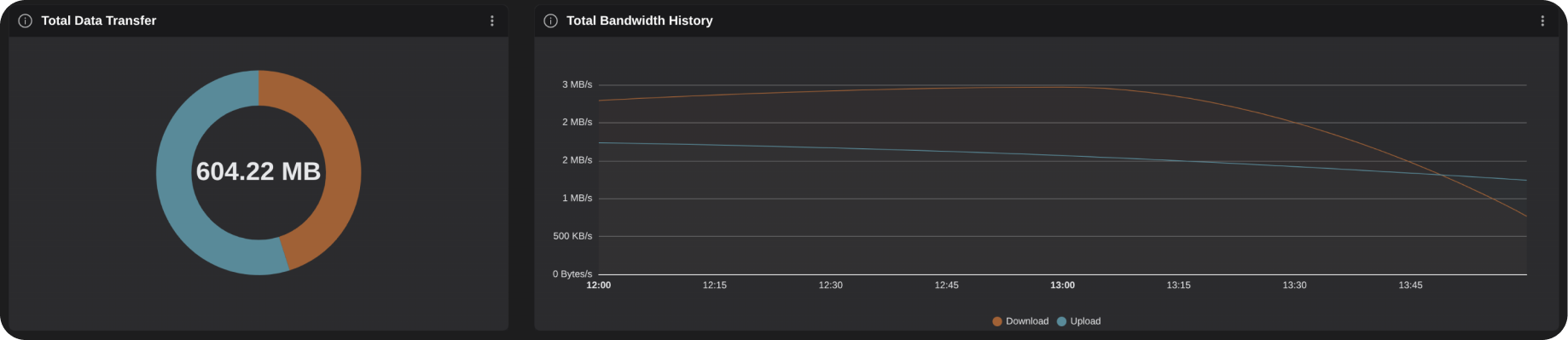
What to look for: Unusually large transfer volumes, unexpected upload-to-download ratios, or anomalous activity during specific time frames such as off hours.
Subnet-to-Subnet Internal Connection
This Sankey diagram shows the volume of top subnet connections, their traffic types, and destinations.
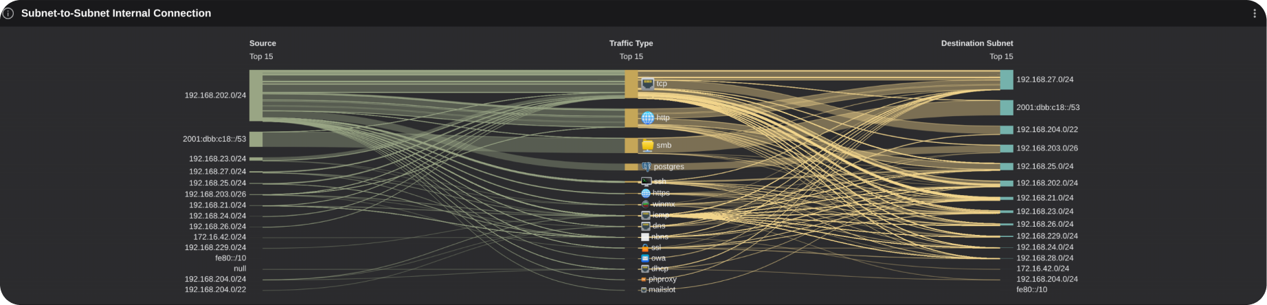
What to look for: Unusual connection volumes to unexpected traffic types, destinations, or from unexpected subnets.
Traffic Destinations
This bubble map shows the volume of connections to external destinations.
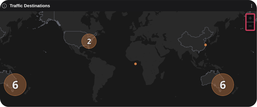
Zooming in on a numbered circle shows finer-grained geolocation as appropriate. Selecting a circle displays a tooltip containing pairs of IP addresses:
- the local host, observed in communication with.
- the external host identified at that location.
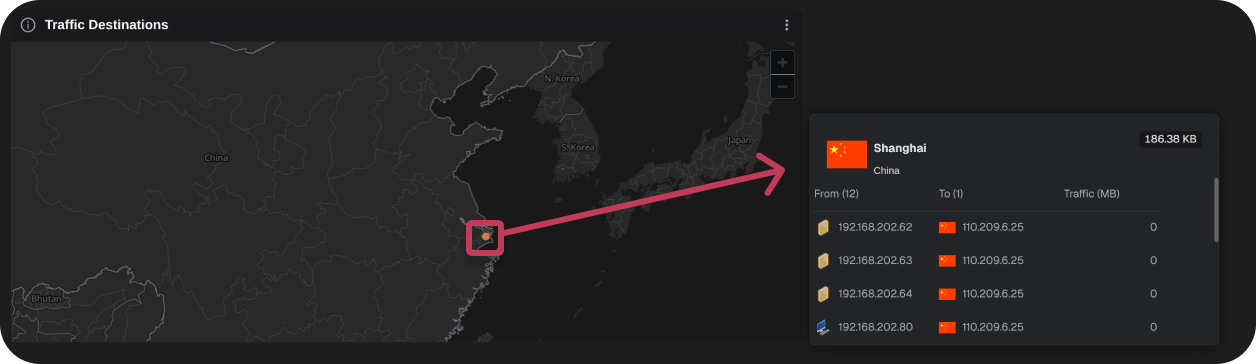
What to look for: Anomalous connection volumes to unexpected countries, cities, or an unusual number of destinations.
Top Protocols by Connection Volume
This stacked bar chart ranks top protocols by upload and download connection volumes.
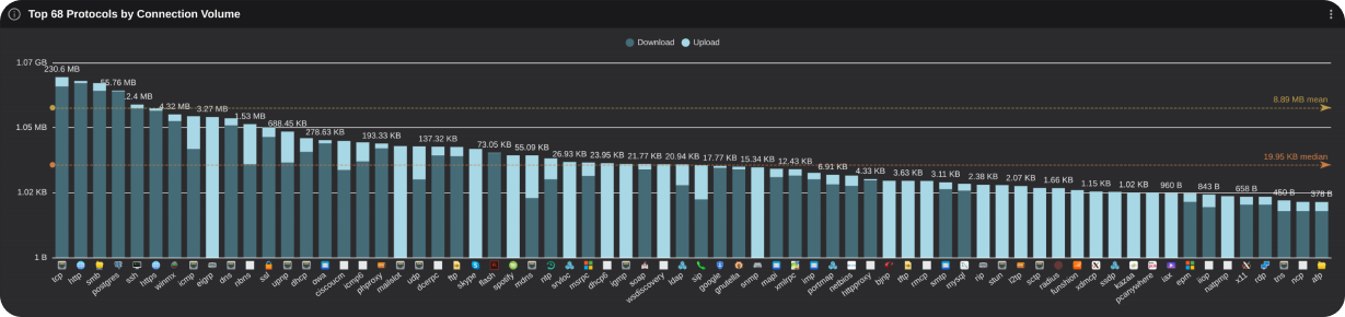
What to look for: Protocols with abnormally high or low volume, or a large number of unexpected protocols.
Exporting
Each table or chart can be exported by selecting the menu button at the top-right of each graphic. To export all visualization select the Export All Charts button at the top left of the **Dashboard**.
Export Options:
- Light or Dark Mode
- Types:
- PPTX
- PDF (wide)
- PNG
- SVG
Note: When exporting as PDF or PPTX, additional information about the graphic will be included.